Nearly every law firm today has a website, but not all websites are created equal. The best lawyer websites feature strategic calls to action (CTAs) to turn prospects into clients. In this article, we’ll discuss:
What is a call to action (plus examples)
Why CTAs are essential to law firm websites
Frequently asked questions about CTAs
Tips for writing a strong lawyer CTA that can improve client conversion
What is a Call to Action?
A CTA is a statement that urges the reader to take action, such as reaching out to your law firm for a consultation. You’ve undoubtedly seen calls to action on websites, emails, videos, digital ads, and social media in the form of buttons and hyperlinks.
Common calls to action include:
Contact us
Call now
Learn more
Read more
See how
Get started
Sign up
Subscribe now
Try free
Click here
Schedule your consultation
Download (a guide, white paper, free sample, etc.)
CTAs operate on a simple concept: If you tell people what they should do next, they’re more likely to take action. This straightforward strategy works. Emails that feature one CTA increased clicks by 371% and sales by 1,617%, according to Unbounce’s 2015 Conversion Road Trip conference.
Implementing a lawyer call to action in your marketing materials can prompt more prospects to engage with your firm—pushing them down the sales funnel toward becoming clients. Ultimately, this means greater profitability for your law firm.
Calls to action can help convert prospects into clients. Emails featuring one CTA increased clicks by 371% and sales by 1,617%.
Lawyer Call to Action FAQs
What makes a good CTA? How can you integrate one into your marketing efforts without sounding too salesy? Below, we’ve answered the most frequently asked questions about CTAs for lawyers.
How Can a Law Firm Benefit from a CTA?
CTAs are a powerful yet simple marketing tool that all lawyers can use to attract potential clients and promote case evaluations. This is the basic standard of CTA law.
Attract Potential Clients
Calls to action are not only ideal for people who are ready to contact your firm; they also attract prospects who aren’t quite sales-ready. For example, look at this social media advertisement from Colorado Legal Group.
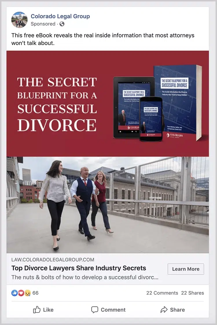
The ad does an excellent job of appealing to potential clients early in the sales process. Perhaps they’re thinking about divorce but aren’t ready to contact a divorce attorney. Colorado Legal Group engages these prospects by providing valuable information—a free, detailed guide about how to have a successful divorce.
The firm then uses a call to action button (“Learn More”) to lead the prospect to the firm’s website, where they can download the guide in exchange for their contact information. Once the firm has this information, it can nurture the relationship until the prospect is ready to become a client.
Consider using CTAs on your marketing materials to urge potential clients who are early in the sales lifecycle to take initial actions, such as:
Downloading a thought leadership piece that provides value while demonstrating your expertise
Following your law firm on social media
Learning more about your law firm
Reviewing case results on your website
Reading a blog article
Watching a short informational video
Reading frequently asked questions
Promote Case Evaluations for Lead Generation
When a prospect is ready to reach out to your law firm for a consultation, a CTA makes it easy to get started.
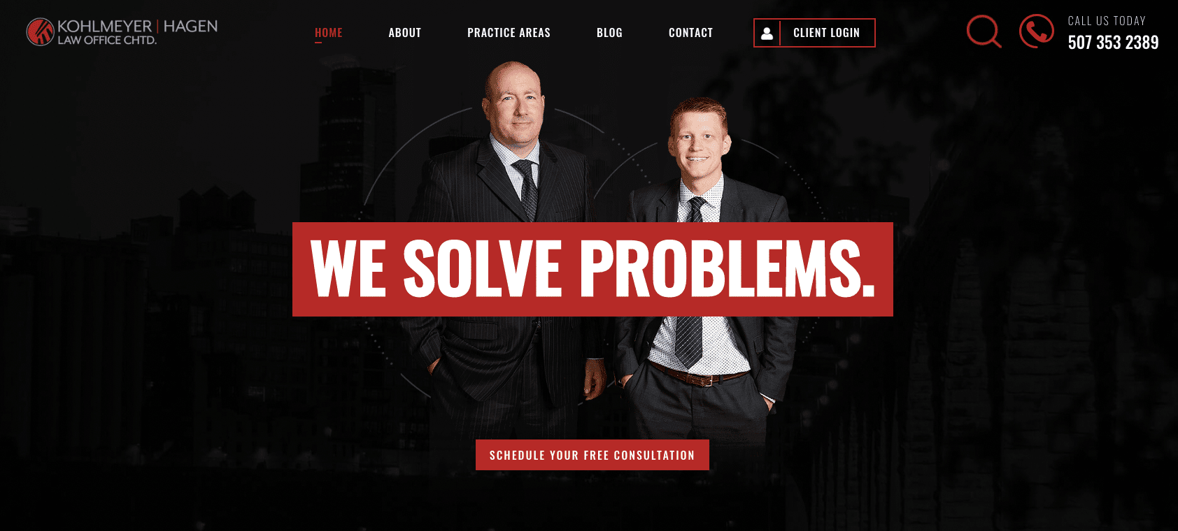
For instance, Kohlmeyer Hagen Law Office uses a prominent CTA button on its website homepage that allows visitors to schedule a free consultation. The firm clearly integrated CTAs into its strategic web design to generate business.
In addition, you can use a website CTA for routing potential clients to a custom client intake form powered by MyCase software. After prospects complete the form, all submitted data flows directly into MyCase. This creates a new client case file without manual data entry for a more efficient workflow. You can even receive notifications whenever a new form is submitted, so your team immediately responds to new inquiries.

Tips for Writing a Strong Lawyer CTA
Developing a high-converting lawyer call to action is all about practice. Use the following three CTA tips on your website and marketing materials.
1. Include an Action Verb
You want your CTA to trigger an action, so use a precise verb that explains your recommended next step. For instance, if your goal is to increase consultation requests on one of your targeted landing pages, try one of the following CTAs.
Get your free case evaluation
Schedule my free evaluation
Talk to an expert about your case
Call to discuss your case now
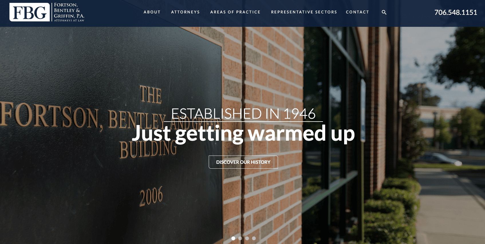
On the other hand, you don’t always want to go with the hard sell or push the same CTA at every opportunity. Consider the website of Fortson, Bentley and Griffin, P.A. Their homepage features a carousel of images, each with its call to action. The first in the series urges visitors to learn more about the firm’s history rather than reaching out for a consultation, which is a great strategy for a historied local firm with strong community ties.
2. Use Value-Centric Language
What’s in it for me? That’s the biggest question your prospects will have when looking at your marketing material. Clarify why they should take your recommended action. For example, you can use surrounding content to clarify your CTA’s value.
The Champion Firm uses this strategy by leveraging the word “free” in their homepage CTA button to showcase the value to potential clients (they won’t have to pay anything for the evaluation). Then, they use the space around their lawyer call to action to stress two things: Clients don’t pay any fees unless they win, and the firm has a stellar track record. This additional information urges website visitors to click the CTA without overcomplicating the CTA itself.

3. A/B Test Various Versions
You’ll never know if you can improve your CTA unless you try. Run an A/B test, an experiment where you split your audience in half to test several CTA variants. This will determine which version of your call to action performs best.
Remember to test only one change at a time, e.g., comparing the existing blue CTA button against the new red option. Even minor tweaks can have a significant impact. For instance, software company SAP found that changing the color of their CTA to orange increased their conversion rate by more than 30%, per QuickSprout.
Your IT or marketing team should be able to set up an A/B test for your website and/or emails. If you don’t have these resources available, you may want to try A/B testing software, such as a specialized plugin for WordPress websites.
How Can I Improve My CTA?
Personalized calls to action convert 202% better than basic CTAs, according to HubSpot. There are several ways to personalize your CTAs for stronger performance.
1. Tailor to Your Law Firm Brand
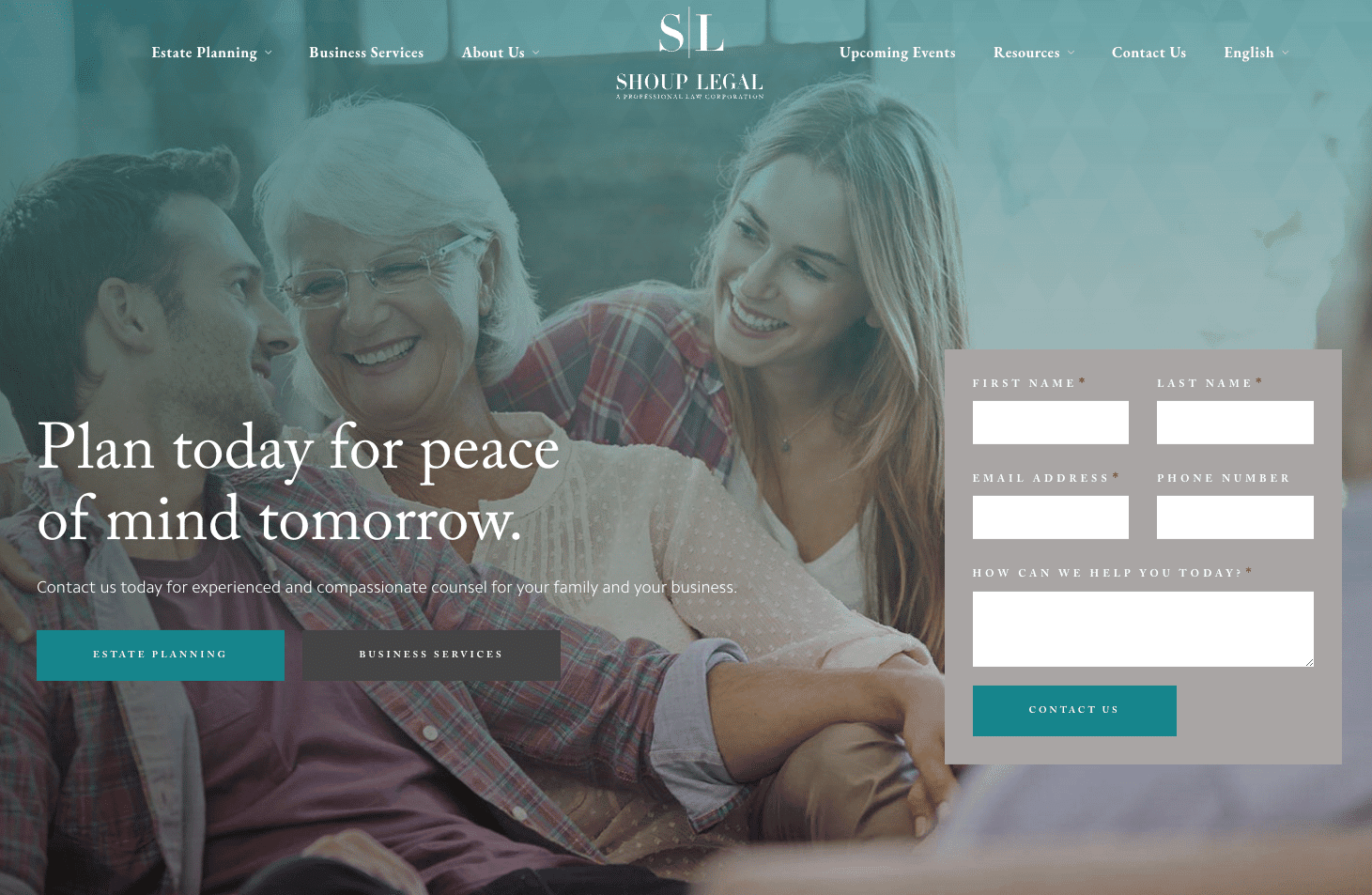
Your firm has its unique look and feel—a CTA that jives with your brand will perform better. For instance, Shoup Legal positions itself as a family-friendly, compassionate estate planning firm. Their homepage focuses on helping clients achieve peace of mind, and they choose to feature a relaxed “Contact us” CTA button in a discreet color.
Hazen Law Group, another estate planning firm, chooses a different approach. Their homepage focuses on “protecting” clients and urges them to “avoid costly mistakes.” They take a more assertive approach with their CTA—“Speak with an attorney.”

The two law firms take very different approaches to their website content and CTAs, but the chosen style works for each firm’s brand. The CTA law of the land: Keep your brand tone and style in mind when writing your law firm’s calls to action.
2. Customize by Client Type
Let’s say you’re a personal injury lawyer. You serve various clients, such as car accident victims, patients and families affected by medical malpractice, and employees injured on the job. Consider creating a webpage for each of these audiences. Include tailored content and a customized client intake form with a CTA. Prospects are much more likely to engage with your firm if they see that you understand and can resolve their unique issue.
3. Personalize Based on Viewer Behavior
Take personalization further and customize your CTAs based on each viewer’s behavior (aka “smart” CTAs). If your content management system has audience targeting capabilities, it may be able to assess each visitor’s behavior and serve them a more targeted CTA.
For instance, new website visitors could receive an offer to sign up for your law firm newsletters, or cover letters. Return visitors could receive an offer for a free consultation since they would be warmer prospects further down the sales funnel.
The Bottom Line About CTAs
All in all, a lawyer call to action is a simple yet powerful tool that can convert prospects into clients. Leverage this guide to design strong CTAs that generate a steady stream of incoming prospects—and don’t forget to use MyCase to convert those prospects into clients and build client relationships. Our law firm CRM and customizable intake process will transform how you manage prospective clients. In addition, you can learn how to write your closing letters, improve your client management skills, as well as how to improve your legal intake process.
Get your 10-day free trial of MyCase today. There’s no commitment required, and you’re free to cancel anytime.
About the author

Morgan MartinezSenior Content Manager
Morgan Martinez is a Senior Content Manager for leading legal software companies, including MyCase, Docketwise, and CASEpeer, as well as LawPay, the #1 legal payment processor. She specializes in writing about the latest advancements in legal technology, financial wellness for law firms, key industry trends, and more.
